


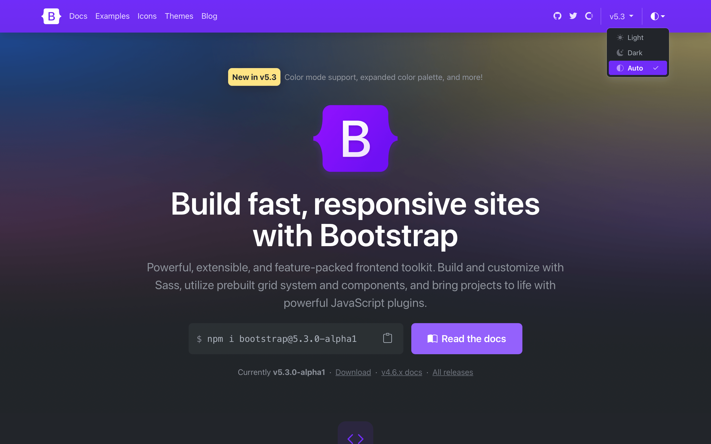
Bootstrap 5.3.0-alpha1
It’s a Christmas miracle—Bootstrap v5.3.0-alpha1 has arrived just in time for the holiday break! This release brings new color mode support, an expanded color palette with variables and utilities, and more. We’re keeping things short and simple in this blog post with deeper dives into the new color modes and more coming in future posts. For now, we want you to enjoy the holiday break and come back next year feeling refreshed and rejuvenated. Keep reading for what’s new and we’ll see you next year! Dark mode and color modes Bootstrap now supports an explicit opt-in for creating multiple color modes via the data-bs-theme attribute on the root element. We opted for a data attribute solution so that you can create any number of themes instead of just light and dark. We use a new Sass mixin, color-mode(), to generate our dark mode styles with either a data attribute (the default) or a media query. The latter is useful if you only have two color modes and want automatic color mode changing via CSS. Read more in the new color mode docs. For those wanting to build something more advanced, you can read how we built our own color mode picker with JavaScript that respects the device or operating system setting by default, but still allows someone to override it with an explicit theme. If you’re using the CDN or starter template, using the new color modes is straightforward. Add the data-bs-theme attribute with light or dark values to the element and you’ll be using either the light or dark theme. Bootstrap demo Hello, world! Want to use CSS media queries to change the color mode instead? You can also build Bootstrap with Sass and customize how you use color modes. Read the docs to learn more. You can even create custom color modes. Expanded color palette We have a huge new color palette update with new Sass variables, CSS variables, and utilities to boot. Foreground and background colors have new secondary, tertiary, and emphasis colors to choose from, while our theme colors have expanded on to include their subtle background colors, subtle border colors, and darker text colors. We’ve rebuilt some components (like list groups and alerts) to use these new variables in their source Sass and compiled CSS so that they respond to the color mode changes. Check out the new colors docs. And more! And a few more noteworthy changes: Added new CSS variables for grid breakpoints, link colors, close button, alert links, forms, and more. In addition, many components have been updated to use more global CSS variables like --bs-border-color to better respond to changing color modes. Floating forms have been updated to be more bulletproof and now include proper support for textareas. Added many new utilities, including fw-medium, overflow and object-fit utilities, z-index, and more. Plus, border-radius utilities have been updated so that you can combine .rounded-{top|bottom|start|end} with .rounded-{0-5|pill|circle}. Fixed some Popper tooltip and popover consistency issues. Be sure to consult the v5.3.0 migration guide to see what’s changed as well. Up next As we iron out the release with your feedback and bug reports, we’ll also be updating the Bootstrap Blog and Bootstrap Icons sites to use the new themes soon. We’ll also continue to refine how our components and utilities work with the new color modes, adding Sass testing to improve our coverage of how folks build with Bootstrap, and much more. Get the release Head to https://getbootstrap.com for the latest. It’s also been pushed to npm: npm i bootstrap@v5.3.0-alpha1 Read the GitHub v5.3.0-alpha1 changelog for a complete list of changes in this release. Support the team Visit our Open Collective page or our team members’ GitHub profiles to help support the maintainers contributing to Bootstrap.


It’s a Christmas miracle—Bootstrap v5.3.0-alpha1 has arrived just in time for the holiday break! This release brings new color mode support, an expanded color palette with variables and utilities, and more.
We’re keeping things short and simple in this blog post with deeper dives into the new color modes and more coming in future posts. For now, we want you to enjoy the holiday break and come back next year feeling refreshed and rejuvenated. Keep reading for what’s new and we’ll see you next year!
Dark mode and color modes
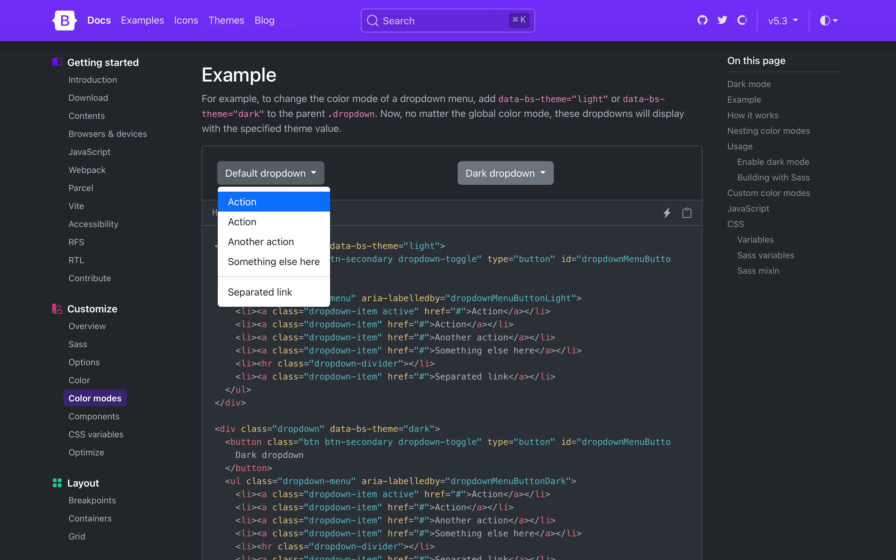
Bootstrap now supports an explicit opt-in for creating multiple color modes via the data-bs-theme attribute on the root element. We opted for a data attribute solution so that you can create any number of themes instead of just light and dark. We use a new Sass mixin, color-mode(), to generate our dark mode styles with either a data attribute (the default) or a media query. The latter is useful if you only have two color modes and want automatic color mode changing via CSS.
Read more in the new color mode docs.
For those wanting to build something more advanced, you can read how we built our own color mode picker with JavaScript that respects the device or operating system setting by default, but still allows someone to override it with an explicit theme.
If you’re using the CDN or starter template, using the new color modes is straightforward. Add the data-bs-theme attribute with light or dark values to the element and you’ll be using either the light or dark theme.
<html lang="en" data-bs-theme="dark">
  <head>
    <meta charset="utf-8">
    <meta name="viewport" content="width=device-width, initial-scale=1">
    <title>Bootstrap demotitle>
    <link href="https://cdn.jsdelivr.net/npm/bootstrap@5.3.0-alpha1/dist/css/bootstrap.min.css" rel="stylesheet" integrity="sha384-GLhlTQ8iRABdZLl6O3oVMWSktQOp6b7In1Zl3/Jr59b6EGGoI1aFkw7cmDA6j6gD" crossorigin="anonymous">
  head>
  <body>
    <h1>Hello, world!h1>
    <script src="https://cdn.jsdelivr.net/npm/bootstrap@5.3.0-alpha1/dist/js/bootstrap.bundle.min.js" integrity="sha384-w76AqPfDkMBDXo30jS1Sgez6pr3x5MlQ1ZAGC+nuZB+EYdgRZgiwxhTBTkF7CXvN" crossorigin="anonymous">script>
  body>
html>
Want to use CSS media queries to change the color mode instead? You can also build Bootstrap with Sass and customize how you use color modes. Read the docs to learn more. You can even create custom color modes.
Expanded color palette
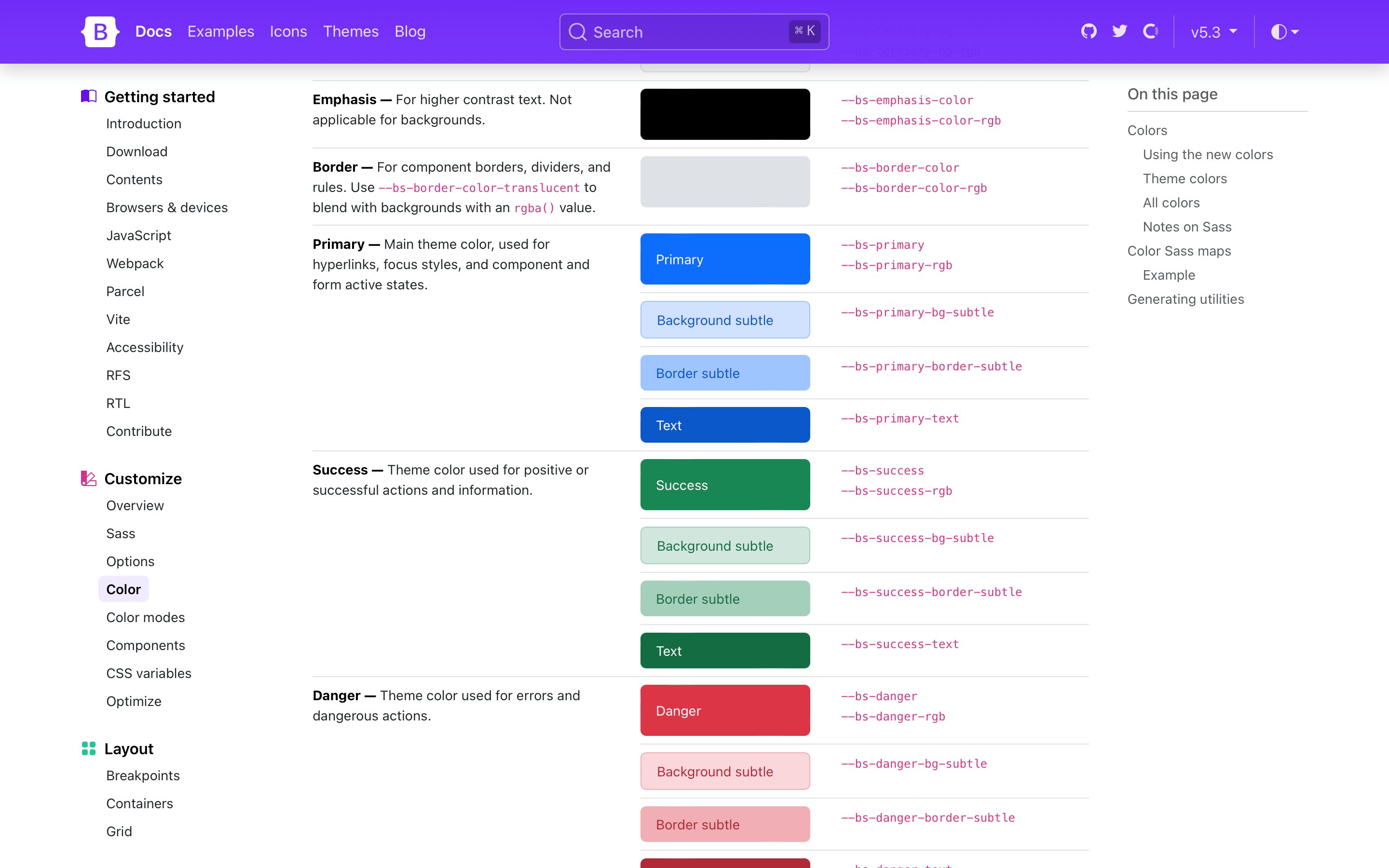
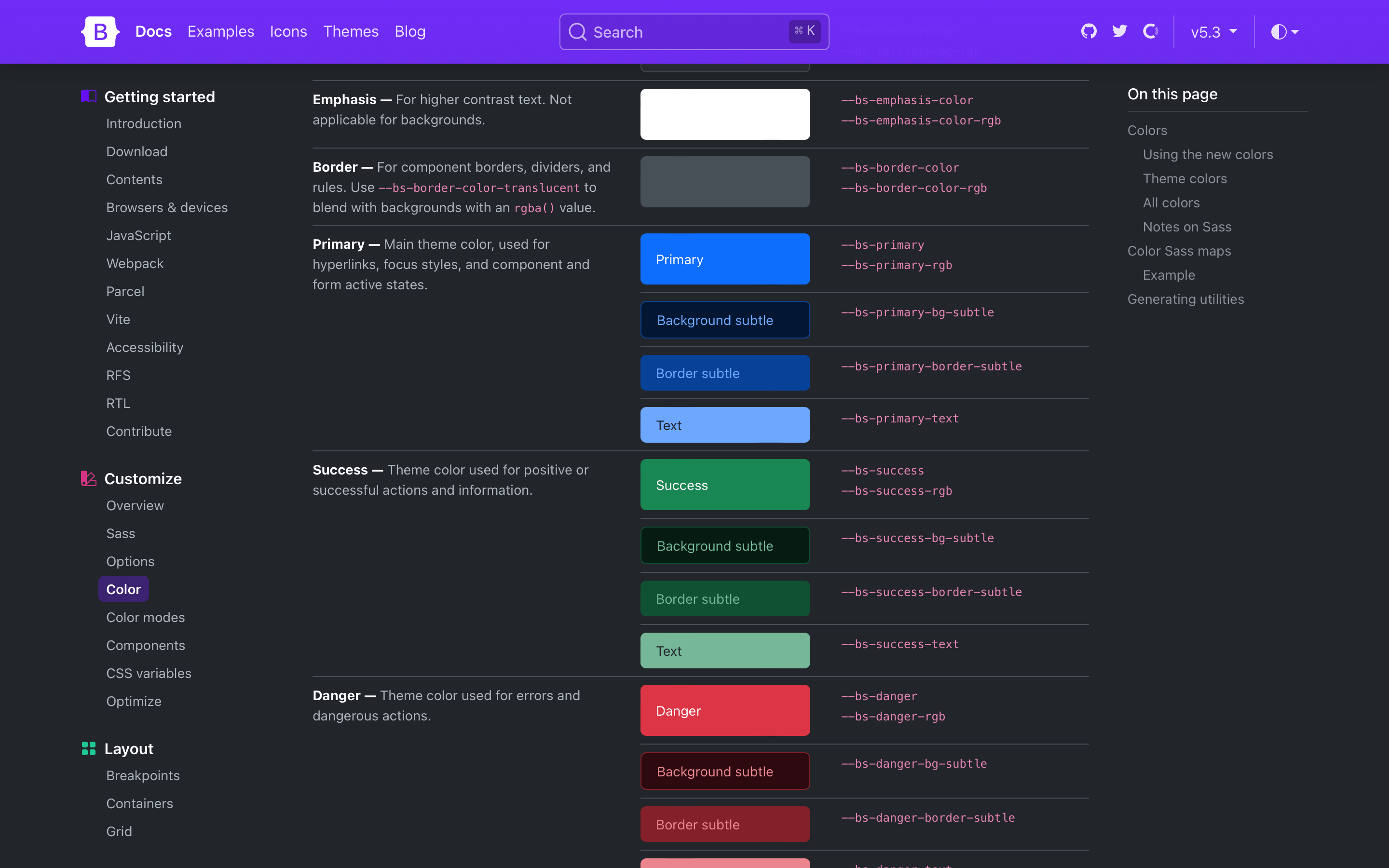
We have a huge new color palette update with new Sass variables, CSS variables, and utilities to boot. Foreground and background colors have new secondary, tertiary, and emphasis colors to choose from, while our theme colors have expanded on to include their subtle background colors, subtle border colors, and darker text colors. We’ve rebuilt some components (like list groups and alerts) to use these new variables in their source Sass and compiled CSS so that they respond to the color mode changes.
Check out the new colors docs.
And more!
And a few more noteworthy changes:
-
Added new CSS variables for grid breakpoints, link colors, close button, alert links, forms, and more. In addition, many components have been updated to use more global CSS variables like
--bs-border-colorto better respond to changing color modes. -
Floating forms have been updated to be more bulletproof and now include proper support for textareas.
-
Added many new utilities, including
fw-medium,overflowandobject-fitutilities, z-index, and more. Plus,border-radiusutilities have been updated so that you can combine.rounded-{top|bottom|start|end}with.rounded-{0-5|pill|circle}. -
Fixed some Popper tooltip and popover consistency issues.
Be sure to consult the v5.3.0 migration guide to see what’s changed as well.
Up next
As we iron out the release with your feedback and bug reports, we’ll also be updating the Bootstrap Blog and Bootstrap Icons sites to use the new themes soon. We’ll also continue to refine how our components and utilities work with the new color modes, adding Sass testing to improve our coverage of how folks build with Bootstrap, and much more.
Get the release
Head to https://getbootstrap.com for the latest. It’s also been pushed to npm:
npm i bootstrap@v5.3.0-alpha1
Read the GitHub v5.3.0-alpha1 changelog for a complete list of changes in this release.
Support the team
Visit our Open Collective page or our team members’ GitHub profiles to help support the maintainers contributing to Bootstrap.